YouTube Thumbnail Size 2026: Exact Pixels, Safe Zones & the Design Rules That Get Clicks
TL;DR: The Short Answer
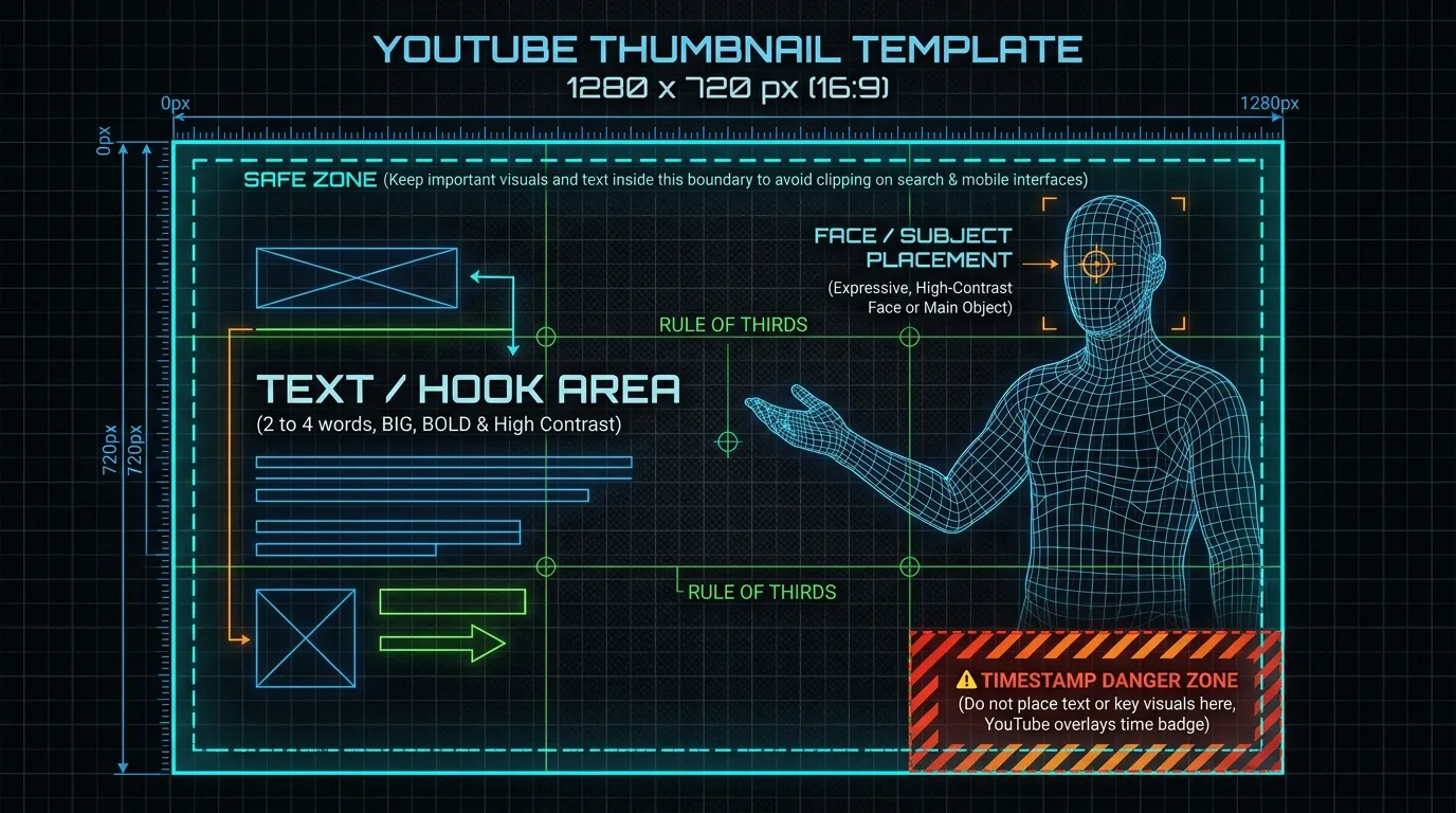
The perfect YouTube thumbnail size is 1280×720 pixels (16:9 aspect ratio), under 2MB, saved as JPG or PNG. Minimum width is 640px — anything smaller gets rejected or looks blurry. Anything not 16:9 gets black bars added automatically. Keep all text, faces, and logos inside the central safe zone (roughly 1120×620px, centered), because the bottom edge gets covered by the video duration timestamp and the sides get cropped on some displays. Before exporting, shrink the thumbnail to 120px wide — if the text is not readable at that size, it is too small for mobile. Design with one face with exaggerated emotion (thumbnails with a face average ~6.8% CTR vs ~4.1% without), 2–4 words of bold text (15–25% of thumbnail height), and high contrast (yellow or white text on a dark background).
Then use YouTube’s native Test & Compare to A/B test up to 3 thumbnails — the winner is chosen by watch time, not click-through rate, so a misleading high-CTR thumbnail loses to an honest one that keeps viewers watching.
The Exact Spec Table (Save This)
| Spec | Value | Notes |
|---|---|---|
| Recommended resolution | 1280×720 px | Universal standard; do not use 4K — overshoots the file cap |
| Aspect ratio | 16:9 | Non-16:9 gets black bars (letterboxed) |
| Minimum width | 640 px | Absolute floor; blurry on modern screens |
| Max file size | 2 MB | Hard cap — exceeded files get rejected with no error message |
| Accepted formats | JPG, PNG, GIF (first frame), BMP | WebP and AVIF are NOT accepted |
| Shorts thumbnail | 1080×1920 px (9:16) | Custom Shorts thumbnails use vertical format |
| Central safe zone | ~1120×620 px, centered | Keep text/faces here; bottom covered by timestamp |
| Custom thumbnail access | Verified account | Requires phone verification in YouTube Studio |
Format choice: Use JPG for photo-based thumbnails (smaller file, photographic content). Use PNG only for graphic-heavy designs with flat colors and text (PNG keeps text edges crisp but file size balloons on photos). Never upload WebP — YouTube does not accept it and you will get a generic upload error.
Why 1280×720, Not Higher?
YouTube displays thumbnails at a maximum of roughly 640–1280px wide depending on the device and placement (TV apps can go larger). Uploading at 1920×1080 or 4K does not improve quality — it just inflates the file size and risks hitting the 2MB cap. At 1280×720, a JPG at quality 85 is usually 150–400KB, comfortably under the limit. At 4K, the same image reaches 2–4MB, and platforms often reject it.
If your source photo is low-resolution or grainy, fix it before designing the thumbnail — a blurry source cannot be saved by text overlays. A guide to fixing grainy photos covers denoising before you start the design.
Safe Zones: Where the Cropping Happens
You never see a thumbnail at its full 1280×720 size with all edges visible. Three overlays and crops eat into it:
- Bottom-right: duration timestamp. YouTube stamps the video length (e.g., “12:34”) in the bottom-right corner, covering roughly the bottom 10% and right 15%. Never put a face or text there.
- Bottom-left: “Watch later” and “Add to queue” buttons appear on hover on desktop. Keep critical content away from the bottom-left too.
- Side cropping on some layouts. On mobile search and some homepage layouts, the left and right ~5% may be cropped. Keep faces and text within the central 85%.
The practical safe zone: central 1120×620px (87.5% width, 86% height, centered). Design everything important inside it. Decorative elements can go to the edges.
The 120px Mobile Test (The Most Important Quality Check)
Over 70% of YouTube views happen on mobile. On a phone, a thumbnail in search results displays at roughly 120–160px wide — about one-tenth of its 1280px source. If your text is unreadable at that size, viewers will not read it; they will scroll past.
How to test: In Photoshop or any editor, zoom the thumbnail out until it is roughly 120px wide on your screen (View > Zoom Out repeatedly, or use Image Size to make a temporary 120px-wide copy). If you cannot read the text instantly, make it bigger. If you cannot tell what the face is expressing, zoom the face in. This single test catches 90% of bad thumbnails before they go live.
Design Rule 1: One Face, Exaggerated Emotion
A 2026 analysis of over 1,000 YouTube thumbnails found an average CTR of ~4.1% without a face and ~6.8% with a face — a 66% lift. But not just any face: the subtle, natural smile you would use in a headshot does not read at thumbnail size. Thumbnails demand exaggerated expressions — wide eyes, open mouth, surprise, excitement, confusion. Zoom the face in so it fills 30–50% of the frame. A wide shot can make a tiny face disappear.
To isolate a face from a busy background, cut it out first and place it on a clean, high-contrast backdrop. A guide to background remover tools covers the fastest ways to cut out a subject.
Design Rule 2: 2–4 Words, Bold Sans-Serif
Text on a thumbnail is not a caption — it is a billboard. The winning formula across niches: 2 to 4 words, in a bold condensed sans-serif font (Anton, Montserrat Black, Impact, Bebas Neue), sized at 15–25% of the thumbnail height (roughly 108–180px tall at 720px height). Any more words and the font shrinks below readability. Any fewer and you give no context.
Add a thick black outline or drop shadow (3–6px) to the text so it reads on any background. Yellow or white text on a dark background is the highest-contrast, most-clicked combination. Avoid mid-gray tones — they blend into every background.
Design Rule 3: High Contrast, One Saturated Color
Contrast is what makes a thumbnail “pop” out of the homepage feed instead of dissolving into it. Three contrast rules:
- Text vs background: differ by at least two brightness levels (light text on dark bg or vice versa).
- Subject vs background: warm subject on cool background, or a bright subject on a dark/neutral backdrop.
- One saturated accent color: pick one color (your brand color, or a high-energy red/yellow) and use it for one element — text, an arrow, a circle. Desaturate everything else. A thumbnail with five competing colors reads as noise.
For tuning the color and contrast of the base image, a guide to color grading covers the adjustment layers that make a thumbnail pop.
Design Rule 4: Clear Visual Hierarchy
Every thumbnail should have a clear first, second, and third thing the eye lands on. If two elements compete for attention (e.g., a big face and equally big text), the viewer resolves the conflict by scrolling. You establish hierarchy with four levers, in order of strength:
- Size — the biggest element is seen first (usually the face).
- Contrast — the highest-contrast element pulls the eye second.
- Position — the eye naturally lands left-of-center, slightly above the middle. Put your most important element there.
- Color temperature — warm colors advance; cool colors recede. Put warm tones on the subject, cool tones on the background.
For broader design principles, a guide to types of graphic design covers layout and hierarchy that translate directly to thumbnails.
How to Make a Thumbnail: 3 Paths
Photoshop (most control):
- Create a new document: 1280×720px, 72 DPI (DPI is irrelevant for screen — only pixels matter), RGB/sRGB.
- Place your base image, cut out the subject, place on a high-contrast background.
- Add text: bold font, 108–180px tall, black outline 3–6px.
- Add one accent element (arrow, circle, emoji-style graphic).
- Export: File > Export > Save for Web (Legacy) or Export As. JPG, quality 80–85, check file size is under 2MB. If over, lower quality or reduce.
Canva (fastest, templates):
Search “YouTube thumbnail” — Canva’s template is already 1280×720. Drag in your photo, use a text template, download as JPG/PNG. Check file size before upload.
Phone apps (on the go):
Canva mobile, Pixellab, or YouTube Studio’s built-in editor. Use the same rules — big face, 2–4 words, high contrast. Export at 1280×720.
A/B Testing: YouTube Test & Compare (2026’s Biggest Feature)
YouTube’s native Test & Compare feature, rolled out broadly in 2025, lets you upload up to 3 thumbnail variants on a single long-form video. YouTube splits impressions evenly across them and picks the winner after up to two weeks. The critical detail: the winner is chosen by watch time, not click-through rate. A misleading thumbnail that gets clicks but drives viewers away in 5 seconds will lose to an honest thumbnail with lower CTR but stronger audience retention. This kills the old clickbait strategy — you can no longer win by over-promising. Use Test & Compare on every video that gets meaningful traffic; test one variable at a time (face expression, text wording, or background color) so you know what actually moved the needle.
5 Common YouTube Thumbnail Mistakes
- Uploading at 1920×1080 or 4K. Overshoots the 2MB cap and gains no quality. Export at exactly 1280×720.
- Text too small. If it is not readable at 120px wide, it is too small. Minimum ~108px tall text.
- Putting text/faces in the bottom corners. Covered by the duration timestamp and buttons. Use the central safe zone.
- Uploading WebP. YouTube does not accept it. Use JPG or PNG only.
- No face, or a tiny face. Thumbnails with a prominent face average ~66% higher CTR. Zoom the face in.
Frequently Asked Questions
What is the exact YouTube thumbnail size in 2026?
1280×720 pixels, 16:9 aspect ratio, under 2MB, saved as JPG or PNG. Minimum width is 640px. Non-16:9 images get black bars added automatically. WebP and AVIF are not accepted.
What is the maximum file size for a YouTube thumbnail?
2MB — a hard cap. Files exceeding it are rejected with no clear error message. A 1280×720 JPG at quality 80–85 is typically 150–400KB, well under the limit. If your file is too big, lower JPEG quality or use JPG instead of PNG.
What is the safe zone for YouTube thumbnails?
Keep all text, faces, and logos in the central ~1120×620px region (centered). The bottom-right is covered by the video duration timestamp, the bottom-left by hover buttons, and the outer ~5% may be cropped on some displays.
How big should text be on a YouTube thumbnail?
15–25% of the thumbnail height — roughly 108–180px tall at 720px height. Use 2–4 words in a bold sans-serif font (Anton, Impact, Montserrat Black) with a thick black outline. Test by shrinking to 120px wide — if unreadable, it is too small.
Do thumbnails with a face get more clicks?
Yes. A 2026 analysis found average CTR of ~4.1% without a face and ~6.8% with a face — a 66% lift. Use an exaggerated expression (surprise, excitement, confusion) and zoom the face to fill 30–50% of the frame.
Can you A/B test YouTube thumbnails?
Yes. YouTube’s native Test & Compare feature lets you upload up to 3 thumbnails per long-form video. YouTube splits impressions evenly and picks the winner by watch time (not CTR) after up to two weeks. Misleading high-CTR thumbnails lose to honest ones with stronger retention.
What size are YouTube Shorts thumbnails?
Shorts use a vertical 9:16 format — 1080×1920 pixels, same as the video itself. Keep text and faces in the central region; the bottom ~20% is covered by the caption, like button, and channel name.
Why is my YouTube thumbnail blurry?
Usually one of three causes: you uploaded below 640px wide (minimum), you uploaded a non-16:9 image that got stretched/letterboxed, or your source image was low-res and you upscaled it. Start from a sharp 1280×720 source, export at quality 80–85, and never upscale.
Final Verdict
The YouTube thumbnail is a 1280×720 conversion system, not a decorative poster. Nail the spec — exact pixels, under 2MB, JPG/PNG, central safe zone — and then design for the 120px mobile screen: one big face with exaggerated emotion, 2–4 words of bold high-contrast text, one accent color, and clear visual hierarchy. Finally, test. YouTube’s Test & Compare has made guessing obsolete — run 3 variants on every important video, let watch time decide the winner, and your CTR and retention will climb together.