Matte vs Glossy Photos: Which Finish Is Actually Better? (2026 Guide)
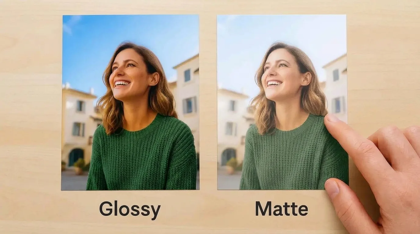
TL;DR — The short answer: Neither is universally “better.” Choose glossy when you want the most vivid color, deepest blacks, and crispest detail for albums, snapshots, and hand-held viewing. Choose matte for framing, bright rooms, portraits, and prints that get handled, because it kills glare and hides fingerprints. If you only want to remember one thing: luster/satin is the safe middle ground that most professional labs use as their default.
You’ve taken the photo. You’ve edited it. You’ve even picked the size. And then, right at checkout, the print lab hits you with the question nobody prepared you for: glossy or matte?
It feels like a tiny decision. It isn’t. That one dropdown changes how your photo looks on the wall, how long it stays clean, whether you can actually see it across the room, and even how true the skin tones stay. After comparing the labs’ own guides, testing notes from working photographers, and the manufacturer data sheets, here’s everything that actually matters — so you never second-guess that dropdown again.
What’s the Real Difference Between Glossy and Matte?
Here’s the secret most drugstore kiosks won’t tell you: glossy and matte prints are often the exact same paper, with the exact same ink or silver-halide chemistry underneath. The only thing that changes is the top coating.
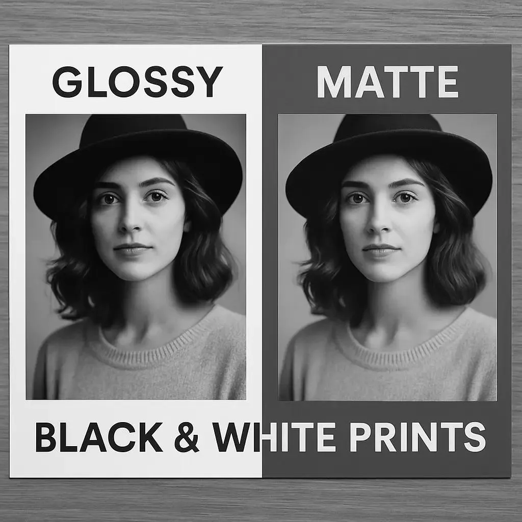
Glossy paper gets a smooth, clear, highly reflective coating. When light hits it, most of that light bounces straight back to your eye — which is why colors look saturated, blacks look deep, and fine detail looks crisp. Matte paper gets a textured, light-diffusing coating. Instead of bouncing light back in a straight line, it scatters it. That kills reflections, but it also softens contrast and slightly mutes color.
Because the image layer is identical, a glossy and a matte print of the same file have roughly the same lifespan. The finish changes the surface, not the longevity — a point labs like Neptune Photo confirm explicitly, since both are printed on the same professional resin-coated silver-halide paper.
Glossy vs Matte: Side-by-Side Comparison
| Factor | Glossy | Matte |
|---|---|---|
| Surface | Smooth, shiny, reflective | Textured, flat, non-reflective |
| Color saturation | Highest — colors “pop” | Slightly softer, more muted |
| Blacks & contrast | Deepest blacks, highest contrast | Lighter blacks, gentler contrast |
| Apparent sharpness | Crispest-looking detail | Slightly softer (texture diffuses) |
| Glare under bright light | Severe — mirrors windows and lamps | Almost none — viewable from any angle |
| Fingerprints & smudges | Show on every touch | Nearly invisible |
| Behind glass | Risk of double reflection + sticking | Safest choice behind glass |
| Best for | Albums, snapshots, landscapes, product shots | Framing, portraits, black & white, high-traffic |
| Cost | Usually identical to matte | Usually identical to glossy |
One common myth worth killing: matte is not “lower quality” and glossy is not “premium.” At most labs they cost the same. They’re just two different tools for two different jobs.
Glossy Photos: Pros, Cons, and When to Pick Them
Glossy is the default you grew up with — the drugstore print that made your childhood vacation photos look bright and alive. It still earns that spot.
The upsides of glossy:
- Maximum color vibrancy. The reflective coating amplifies saturation, so sunsets, flowers, travel shots, and landscapes look their most alive.
- Deepest blacks and highest contrast. A glossy print gives you the richest D-max (maximum black density) of any standard finish.
- Crispest perceived detail. The smooth surface makes fine texture — hair, fabric, foliage — look sharper.
- Easy to wipe clean. A microfiber cloth takes dust right off.
The downsides of glossy:
- Glare. In any room with windows or overhead lights, a glossy print starts behaving like a mirror.
- Fingerprints. Every time you pick it up, you leave a mark. Handle by the edges only.
- Scratches show. The smooth coating makes fine scratches obvious.
- Risky behind glass. Glass already reflects light; add a glossy surface underneath and you get two reflective layers.
Pick glossy when: the print will live in an album or photo box, be viewed in hand, or hang in a room with carefully controlled, low-angle light. It’s also the classic choice for high-energy color — landscapes, street photography, and product shots.
Matte Photos: Pros, Cons, and When to Pick Them
Matte is the quiet, grown-up choice. It doesn’t shout; it lets the photo do the talking.
The upsides of matte:
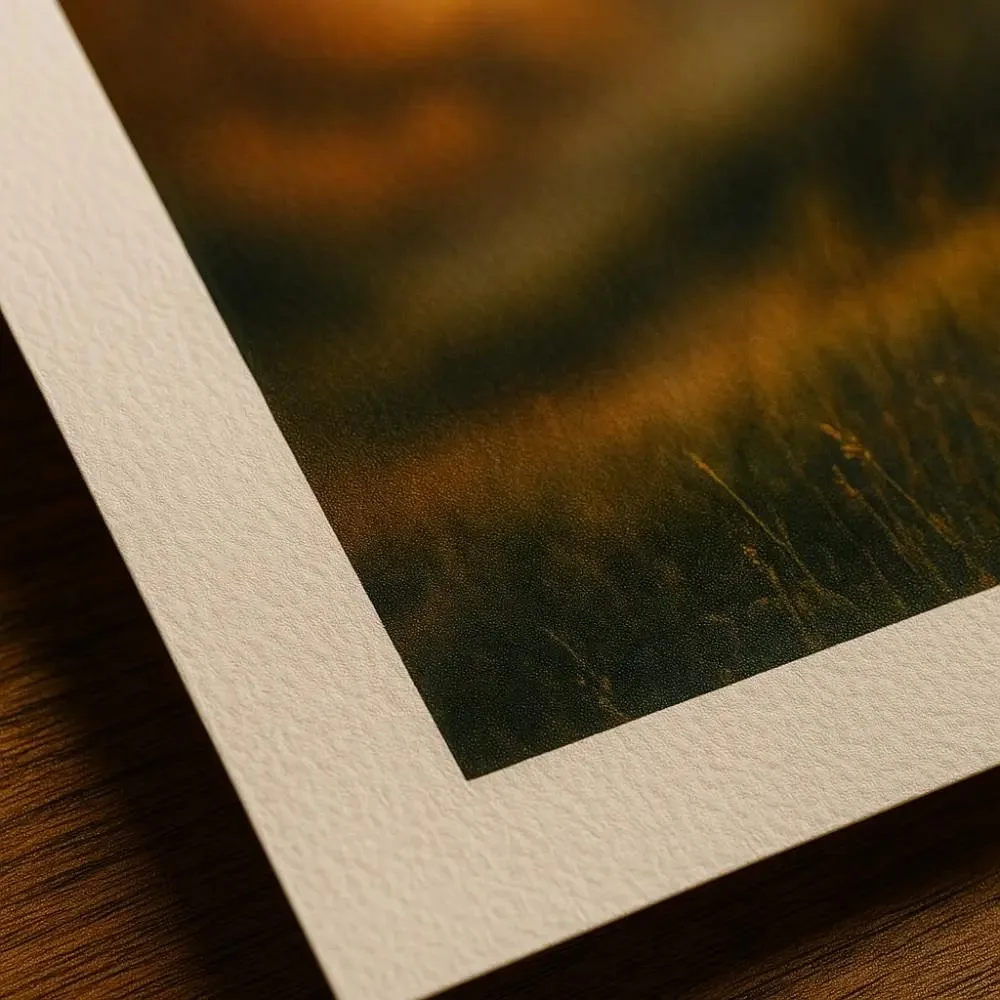
- Zero glare. It absorbs and scatters light, so you can see the print clearly from almost any angle in almost any room.
- Hides fingerprints and scuffs. The textured surface means handling marks basically disappear.
- Flattering for portraits. Softer contrast and gentle gradation flatter skin tones and give a classic, understated feel.
- The best choice behind glass. No double-reflection problem, and it won’t stick to the glass over time.
- Timeless, fine-art feel. Many galleries and professional portrait photographers default to matte for exactly this reason.
The downsides of matte:
- Colors are less punchy. If your photo lives on vibrant color, matte will dial it back a notch.
- Blacks look lighter — more charcoal than true black.
- Can look slightly less sharp up close, because the paper texture diffuses fine detail.
- Harder to clean. The texture traps dust; wiping can do more harm than good, so use a soft brush or compressed air.
Pick matte when: you’re framing the print, hanging it in a bright room or hallway, printing portraits or black & white, or making prints that kids, relatives, and scrapbook pages will actually touch.
Beyond Glossy and Matte: Luster, Satin, Pearl, Silk & Deep Matte
If the choice between just two finishes feels too simple, that’s because it is. Professional labs offer a whole spectrum between them — and once you know these, you may never pick plain glossy or matte again. Bay Photo Lab, for example, lists lustre, glossy, silk, Fujicolor Crystal Archive Deep Matte Velvet, and pearl surfaces on its standard photographic prints.
Luster (a.k.a. Satin or Pearl) — the pro default
Luster sits right in the middle: a fine pebble-grain texture with a subtle semi-gloss sheen. It keeps most of glossy’s color punch — labs estimate roughly 60% of glossy’s color lift — while cutting glare and hiding fingerprints. It also renders skin tones more accurately than glossy, which is why wedding and portrait photographers treat it as their everyday default. If you can only ever choose one finish, choose luster.
Silk and Deep Matte Velvet — for fine-art moods
Silk finishes add a fabric-like texture that warms highlights and softens hard contrast, which is why some photographers love it for dramatic, hard-lit portraits. Deep Matte Velvet (often a Fujifilm Crystal Archive surface) goes even further: an ultra-matte, velvety feel with the lowest contrast of all, perfect for moody fine art and black & white where tone matters more than punch.
Metallic — the showstopper
Metallic paper (like Kodak Endura Premier Metallic) embeds a pearlescent layer that makes highlights glow. It’s dramatic and gorgeous for landscapes and abstracts, but it reflects even more than glossy, so treat it as a special-occasion finish, not an everyday one.
Which Finish for Which Photo?
Use this cheat sheet the next time you’re staring at that checkout dropdown.
| Photo type | Best finish | Why |
|---|---|---|
| Family snapshots & kids | Luster or matte | Hides fingerprints, survives handling |
| Weddings & portraits | Luster (matte as alternative) | Accurate skin tones, balanced contrast |
| Landscapes & travel | Glossy or luster | Maximum color and depth |
| Black & white / fine art | Matte or deep matte | Tonal gradation stands out without shine |
| Product & commercial | Glossy | Bold, attention-grabbing color |
| Framed wall art | Matte or luster | No glare behind glass |
| Albums & scrapbooks | Glossy or luster | Viewed in hand, no glare issue |
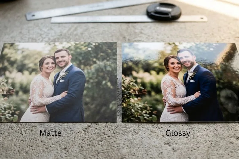
For portraits and weddings, luster wins most often. It gives you the color depth glossy promises without the oversaturation that can make skin look plastic — and it forgives the occasional fingerprint at a wedding viewing.
For black & white, the choice is purely aesthetic. Glossy delivers the deepest blacks and strongest contrast; matte delivers the quietest, most gallery-like gradation. Print a small test in both if you’re unsure.
Framing Behind Glass: The Glare Problem Nobody Warns You About
This is where most people get it wrong. If you’re putting the print behind glass, matte (or luster) is almost always the right call — and here’s the physics of why.

The double-reflection trap
Glass already reflects about 4% of the light that hits it. Put a glossy print behind that glass and you’ve added a second reflective surface. In a bright room, the two layers bounce light between each other, and your photo starts looking like a mirror with a picture somewhere behind it. It gets worse in kitchens, living rooms with big windows, and hallways lit from multiple angles.
The sticking problem
Over time, glossy prints can actually adhere to the glass, especially in humid conditions. Once that happens, removing the print can tear the emulsion. Matte prints don’t do this — their textured surface keeps a tiny air gap.
If you insist on glossy behind glass
You can make it work, but you’ll need to upgrade to anti-reflective (museum) glass or acrylic with UV coating. It cuts reflection dramatically and protects against fading. Expect to pay a premium. Then hang the print on a wall perpendicular to the window, not opposite it, so direct light never lands on it. For large statement pieces, read up on how large prints behave before you commit to a finish.
Albums, Scrapbooks & Prints You Actually Handle
If the print is going to be touched — passed around at a family gathering, slipped into a scrapbook, or flipped through in an album — fingerprints become the deciding factor.
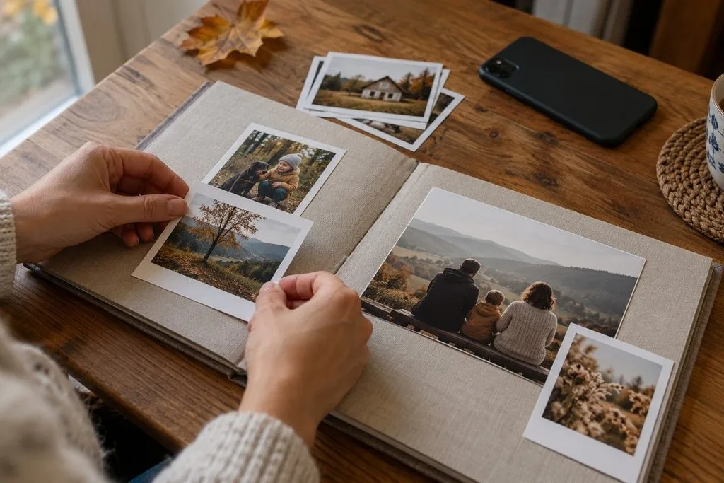
- Glossy is fine inside sealed album sleeves or behind plastic, where fingers never touch the surface. It makes album pages look bright and vibrant.
- Matte or luster is better for loose prints, scrapbook pages, and any print that will be handled without protection. The textured surface hides fingerprints so well you’ll forget they’re there.
Pro tip from album makers: if you’re signing prints or writing on the back, matte paper takes pen far better than glossy, where ink tends to smear.
Longevity & Care: Do They Fade Differently?
Short answer: not meaningfully. Because both finishes share the same image layer, fade resistance is determined by the paper chemistry and ink, not the coating. But the numbers are still worth knowing, because they’ll change how you display and store them.
How long do prints actually last?
- Traditional silver-halide (chromogenic / C-type) prints — the kind most consumer and pro labs make on Kodak Endura or Fujifilm Crystal Archive paper — last roughly 17 to 40 years on display under glass in typical home conditions, and 50 to 100+ years in dark, cool, dry storage, according to Wilhelm Imaging Research, the independent lab that sets the standard for print permanence testing.
- Premium archival papers like Fujicolor Crystal Archive are rated by Wilhelm tests at over 100 years of display life and 200+ years in dark storage.
- Pigment-ink fine-art prints on cotton-rag paper go further still: Epson’s UltraChrome HDX inks on premium glossy paper are rated at roughly 200 years for black & white and 110 years for color under museum lighting (150 lux, UV-filtered).
The finish doesn’t change these numbers much — but where you hang the print does. Direct sunlight is the #1 cause of fading, and it hits glossy and matte equally. UV-filtering glass or acrylic, and keeping prints out of direct sun, does more for longevity than any finish choice.
Care tips that actually work
- Handle by the edges — always, but especially with glossy.
- Dust matte prints with a soft brush or compressed air, not a cloth; wiping pushes grit into the texture.
- Wipe glossy prints gently with a dry microfiber cloth if they smudge.
- Store loose prints in acid-free sleeves or boxes, away from humidity and sunlight.
- If you’ve inherited prints that are already showing their age, here’s how to rescue faded photos before you reprint them.
Before You Hit Print: 5 Prep Tips That Matter More Than Finish
The best finish in the world can’t save an under-prepared file. Do these five things before you upload, and your print will look like the lab did you a favor.
- Get the resolution right. For a crisp print, aim for 300 PPI at your final print sizes. If you’re unsure what resolution your file needs, this guide to DPI for printing spells out the exact numbers by size. Low-res files look soft on any finish — and matte, which already softens detail, is the least forgiving.
- Use the right color space. Export your file as sRGB for consumer labs, or Adobe RGB if your lab explicitly supports it. Sending the wrong color space is the #1 reason prints come back looking duller than your screen — and you’ll wrongly blame the finish.
- Sharpen for print, not for screen. Prints need slightly more sharpening than screen images because ink and paper diffuse detail. Learn how to sharpen photos appropriately, then add a touch more for large formats. If you’re prepping many files at once, a good printing software can batch-apply the right sharpening and color profile.
- Turn off the lab’s auto color correction — if you edited the file. Labs offer “auto correction” for unedited phone snapshots. If you’ve already spent time editing (or paid for professional color correction or photo retouching), select “no color correction” at checkout. Otherwise the lab’s auto pass will shift your carefully tuned colors.
- Order a small test print first — especially for big or expensive jobs. Print a 4×6 of your image in the finish you’re considering, look at it in the actual room light it will live in, and you’ll avoid a costly mistake. If you’re working from old or damaged originals, a quick editing guide pass first can make a bigger difference than any finish.
Quick Decision: Which Finish Should You Choose?
Still undecided? Run through this checklist:
- Framing it? → Matte or luster. (Glossy only with anti-reflective glass.)
- Going in an album or box? → Glossy or luster.
- Portraits, weddings, skin tones? → Luster, then matte.
- Bright room, big windows, hallway? → Matte.
- Landscapes, vibrant color, you want “wow”? → Glossy (or luster if glare is a concern).
- Black & white / fine art? → Matte or deep matte velvet.
- Kids will touch it? → Matte or luster.
- Still can’t decide? → Luster. It’s the default at professional labs for a reason.
Frequently Asked Questions
Is glossy or matte better for photos?
Neither is better overall. Glossy gives more vivid color, deeper blacks, and sharper-looking detail. Matte eliminates glare, hides fingerprints, and is safer behind glass. The right choice depends on how and where the print will be viewed.
Is matte or glossy better for framing?
Matte is better for framing behind standard glass because it doesn’t create a double reflection and won’t stick to the glass over time. Luster is a close second. Glossy can work behind glass only if you use anti-reflective museum-grade glass and control the room’s light.
Do matte photos last longer than glossy?
No. Both finishes are typically printed on the same paper with the same image chemistry, so fade resistance is essentially identical. Longevity is determined by paper/ink quality, UV exposure, humidity, and storage — not by the coating.
Why do my glossy prints show fingerprints?
The smooth, oily coating on glossy paper reveals every oil mark from your skin. Matte’s textured surface diffuses those marks so they’re nearly invisible. Handle glossy prints by the edges and clean smudges with a dry microfiber cloth.
What is luster, satin, or pearl finish?
They’re all names for the same family of semi-gloss finishes between glossy and matte. They have a fine pebble texture, keep most of glossy’s color vibrancy, resist glare and fingerprints, and are the default choice at most professional photo labs.
Which finish is best for black and white photos?
It’s a matter of taste. Glossy gives the deepest blacks and strongest contrast; matte gives the softest, most gallery-like tonal gradation. Many fine-art photographers prefer matte or deep matte velvet for monochrome.
Are matte or glossy prints more expensive?
At most labs, glossy and matte cost exactly the same. Premium finishes like luster, silk, metallic, or fine-art cotton-rag papers usually cost a little more.
Should I get the same finish for a gallery wall?
Yes — for a cohesive look, use one finish across an entire gallery wall. Mixing finishes creates inconsistent reflections that make the arrangement feel unbalanced.
Final Verdict
The matte vs glossy debate only feels like a contest because we’ve been trained to pick one “winner.” There isn’t one. Glossy exists to make color sing; matte exists to make a photo viewable anywhere; and luster exists to give you most of both.
So stop asking “which is better” and start asking “where will this live?” If it’s going on a wall in a real room with real windows, go matte or luster. If it’s going in an album to be held and admired, go glossy. And if you’re staring at the checkout screen with no strong opinion, pick luster — it’s the choice professional photographers make when they don’t want to think about it either.