sRGB vs Adobe RGB: Why Your Photos Look Washed Out Online — and the “Edit Wide, Export Narrow” Rule
TL;DR: The Short Answer
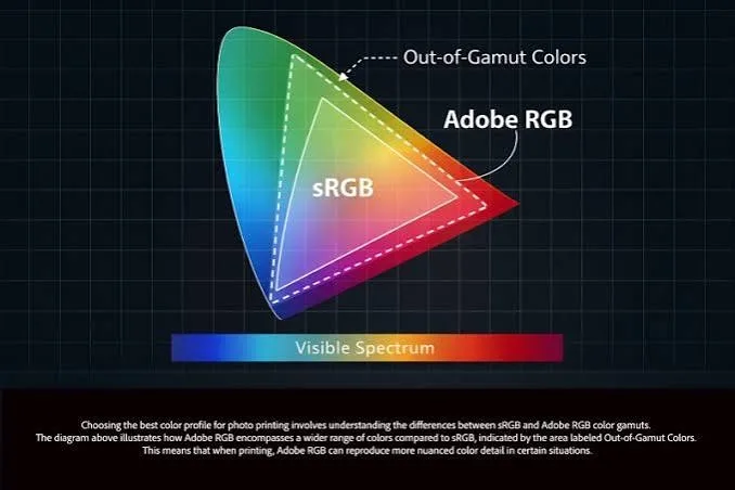
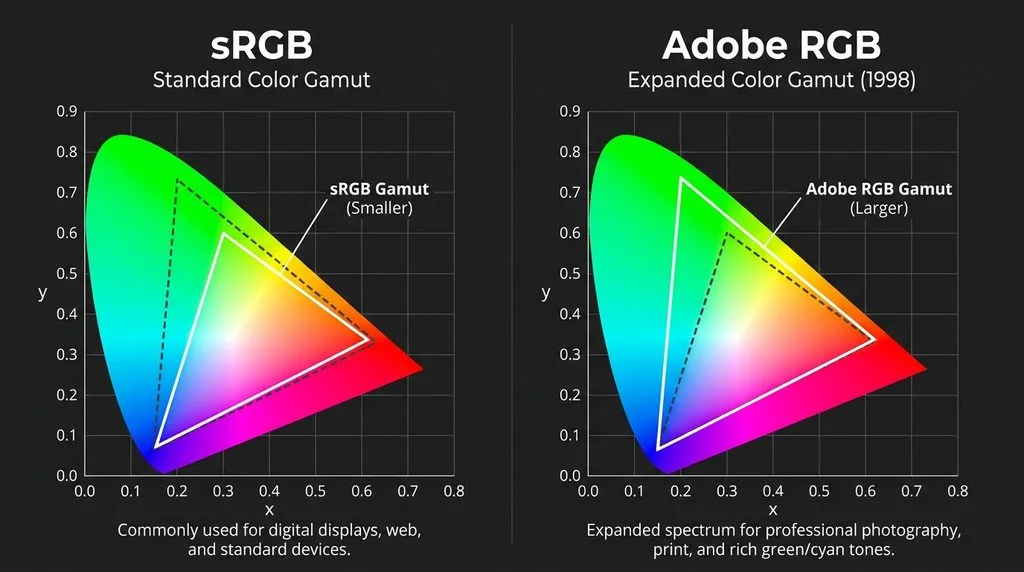
sRGB is the universal web standard — created by HP and Microsoft in 1996, it covers ~35% of colors the human eye can see, and every browser, phone, social platform, and consumer printer assumes sRGB. Adobe RGB (1998) is wider — ~50% of visible colors, ~35% more than sRGB, concentrated in cyan and green — designed for professional print. The #1 mistake photographers make: editing in Adobe RGB and uploading to the web without converting. Browsers and social platforms strip or ignore the Adobe RGB profile and interpret the numbers as sRGB, so your vibrant greens and cyans look flat, muddy, and desaturated.
The rule: edit wide, export narrow. Work in ProPhoto RGB (or Adobe RGB) at 16-bit while editing — it preserves everything your camera captured. At export, convert to sRGB + embed the ICC profile for web/social/email, or Adobe RGB only if a pro print lab specifically requests it. Convert to Profile (correct) is not the same as Assign Profile (wrong — it just relabels colors). For print, most consumer labs want sRGB; pro labs and wide-gamut inkjets benefit from Adobe RGB.
The Core Difference: Gamut Size
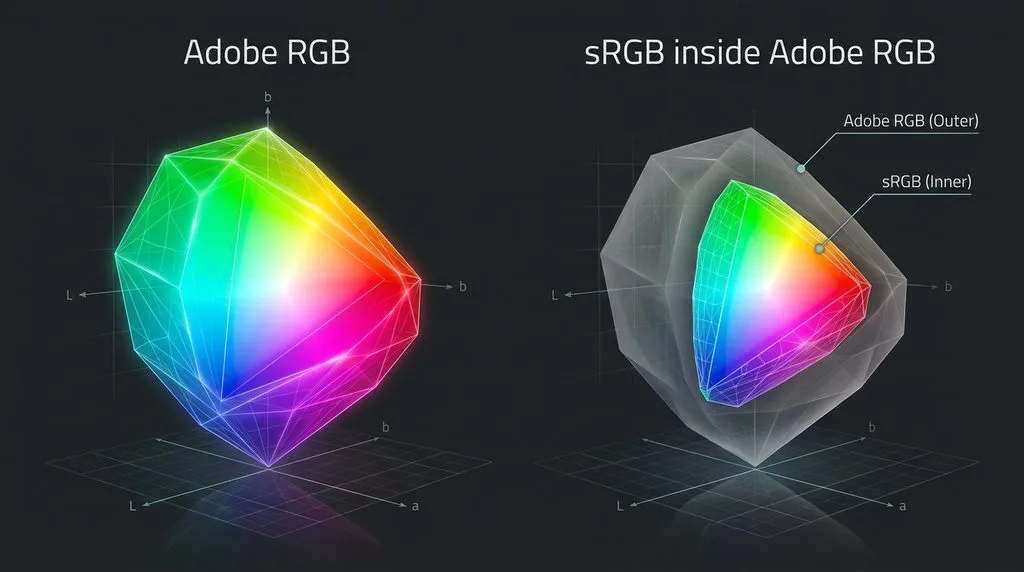
A color space is a defined set of colors — a “box” your image’s colors must fit inside. The bigger the box, the more colors it can hold. But a bigger box only helps if every device in the chain can show those colors.
| Color space | % of visible colors | Created | Best for |
|---|---|---|---|
| sRGB | ~35% | 1996 (HP/Microsoft) | Web, social, phones, consumer print |
| Adobe RGB (1998) | ~50% | 1998 (Adobe) | Pro print, wide-gamut inkjets |
| Display P3 | ~45% (~25% wider than sRGB) | 2005 (DCI/Apple) | Apple devices, video, OLED |
| ProPhoto RGB | ~90% | 2000s (Kodak/Adobe) | Editing working space only |
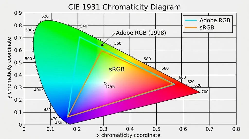
Adobe RGB’s extra colors sit almost entirely in the cyan-green region — lush foliage, tropical water, teal skies, emerald fabric. If your photos don’t contain highly saturated cyans or greens, the difference between sRGB and Adobe RGB is invisible even on a wide-gamut monitor.
The Washed-Out Web Trap (Why Adobe RGB Fails Online)
Here’s what happens when you upload an Adobe RGB file to Instagram, Facebook, a website, or email:
- The file contains color numbers written for the wide Adobe RGB “rulebook.”
- The browser/platform strips the ICC profile (most do) or ignores it.
- Having no instruction, the browser assumes sRGB — the universal default.
- It reads Adobe RGB color numbers as if they were sRGB numbers.
- Adobe RGB’s wide range gets squeezed into sRGB’s smaller box — everything desaturates. Vivid reds go muddy, deep cyans wash out, greens go grey. The whole image looks flat.
The fix is one checkbox at export: Convert to sRGB + Embed Color Profile. In Lightroom: File > Export > Color Space > sRGB. In Photoshop: File > Export > Export As > check “Convert to sRGB” and “Embed Color Profile.” Or Edit > Convert to Profile > sRGB IEC61966-2.1, then Save. A guide to image formats compared covers how JPEG/PNG/WebP handle embedded profiles; a guide to pixels, DPI, and file size covers export settings; a guide to photo printing software covers color-managed print workflows; a guide to best photo editing software covers which editors handle color management correctly.
Convert to Profile vs Assign Profile (They Are Not the Same)
This is the single most common color-management error. They do opposite things:
- Edit > Assign Profile — keeps the pixel numbers exactly the same, just labels them with a different profile. Colors shift dramatically. This is almost always wrong.
- Edit > Convert to Profile — remaps the pixel numbers so the colors look the same in the new color space. Out-of-gamut colors get clipped to the nearest in-gamut color. This is what you want at export.
If you open an untagged image and Photoshop asks “assign profile?” — assign the profile you believe it was created in (usually sRGB), then convert to your working space. Never “assign” a different profile to fix colors — that just relabels them.
Edit Wide, Export Narrow (The Professional Workflow)
The color space you edit in and the color space you export in serve different purposes — don’t use one for both:
- Capture: RAW (color space is irrelevant — RAW stores all data; camera’s sRGB/Adobe RGB setting only affects the JPEG preview and metadata).
- Edit: ProPhoto RGB at 16-bit (Lightroom’s default internal space, “Melissa RGB,” is ProPhoto-based). Or Adobe RGB if you prefer. Wide gamut + high bit depth = no banding when you push edits hard.
- Export for web/social/email: sRGB, 8-bit, embed profile.
- Export for pro print lab: Adobe RGB only if the lab requests it; otherwise sRGB (most consumer labs and online print services require sRGB).
- Export for press/CMYK: convert to the printer’s CMYK profile at the end, using soft proofing.
Working in sRGB while editing is like painting with a limited palette then discovering you can’t add that perfect green — it was never in the box. Working in ProPhoto then converting to sRGB at export keeps every option open until the last moment.
Display P3: The Wide-Gamut Wildcard (Apple + OLED)
Most modern iPhones, MacBooks, Samsung flagships, and OLED monitors cover Display P3 — ~25% wider than sRGB, with extra reds and greens. Browsers (Safari always, Chrome/Firefox recent versions) are ICC-aware and can display P3 colors if the profile is embedded. For most photographers, sRGB is still the safe default — viewers on non-P3 screens see clamped colors. If your audience is primarily Apple-device users and you want richer reds/greens, you can export in Display P3 with an embedded profile, but test on multiple devices. Never export in ProPhoto or Adobe RGB for web — they’re not reliably supported and will look wrong on most screens.
Monitors: Can You Even See the Difference?
Most consumer laptops and monitors cover 95–100% of sRGB but only 70–80% of Adobe RGB. If you’re editing on a standard screen, you literally cannot see the extra colors Adobe RGB contains — you’re editing blind. Professional photo-editing monitors cover 95%+ of Adobe RGB or DCI-P3 and should be calibrated monthly with a hardware calibrator (X-Rite i1Display, Datacolor Spyder). An uncalibrated wide-gamut monitor is worse than a calibrated sRGB monitor — it shows oversaturated colors that don’t match anyone else’s screen.
Soft Proofing: See the Future Before You Export
View > Proof Setup > Custom (Photoshop) or the soft-proofing icon in Lightroom lets you simulate your output target (sRGB for web, a specific lab’s ICC profile for print). Check “Simulate Paper Color” for print. If something looks washed out or shifted in soft proof, it will look that way on the target. Adjust now, not after you’ve uploaded or printed.
Decision Matrix: Which Color Space When
| Use case | Edit in | Export as | Embed profile? |
|---|---|---|---|
| Instagram/Facebook/web | ProPhoto/Adobe RGB | sRGB | Yes |
| Email / messaging | ProPhoto/Adobe RGB | sRGB | Yes |
| Consumer print lab (most) | ProPhoto/Adobe RGB | sRGB | Yes |
| Pro print lab (requests Adobe RGB) | ProPhoto/Adobe RGB | Adobe RGB | Yes |
| Wide-gamut inkjet (self-print) | ProPhoto/Adobe RGB | Adobe RGB or printer profile | Yes |
| CMYK press | ProPhoto/Adobe RGB | CMYK (printer profile) | Yes |
| Archive / master | — | ProPhoto TIFF/PSD 16-bit | Yes |
5 Common Color Space Mistakes
- Uploading Adobe RGB to web. Colors look flat. Convert to sRGB + embed.
- Using Assign Profile instead of Convert to Profile. Colors shift badly. Always Convert.
- Forgetting to embed the ICC profile. Untagged files = browser assumes sRGB = wrong colors.
- Editing in sRGB. Limits your palette from the start. Edit in ProPhoto/Adobe RGB.
- Editing on an uncalibrated wide-gamut monitor. You see oversaturated colors no one else sees. Calibrate.
Frequently Asked Questions
What is the difference between sRGB and Adobe RGB?
sRGB (1996) covers ~35% of visible colors and is the universal standard for web, phones, social media, and consumer printers. Adobe RGB (1998) covers ~50% — about 35% more colors, concentrated in cyan and green — and is designed for professional print. Upload an Adobe RGB file to the web without converting and it looks washed out, because browsers assume sRGB.
Should I use sRGB or Adobe RGB?
Edit in a wide space (ProPhoto or Adobe RGB) and export in sRGB for web/social/email and most consumer printing. Use Adobe RGB at export only if a professional print lab specifically requests it. The camera’s sRGB/Adobe RGB setting only matters if you shoot JPEG — RAW ignores it (you choose the color space at export).
Why do my photos look dull/washed out on Instagram/Facebook?
Almost certainly because you exported in Adobe RGB (or ProPhoto/Display P3) without converting to sRGB. Browsers and social platforms strip the color profile and interpret the numbers as sRGB, desaturating everything. Fix: export with “Convert to sRGB” and “Embed Color Profile” checked.
What does “embed color profile” mean?
An ICC profile is a small tag embedded in the file that tells the browser/printer “these color numbers were written for the sRGB (or Adobe RGB) rulebook.” If it’s missing, the device assumes sRGB. Always embed the profile — it’s a few hundred bytes and prevents 90% of color problems.
What is the difference between Convert to Profile and Assign Profile?
Convert to Profile remaps the pixel numbers so colors look the same in the new space (correct at export). Assign Profile keeps the numbers identical and just relabels them (colors shift — almost always wrong). If Photoshop asks to assign a profile on open, assign the profile you believe the file was created in, then convert to your working space.
What is ProPhoto RGB?
ProPhoto RGB covers ~90% of visible colors — far wider than Adobe RGB. It’s used as an editing working space (Lightroom’s internal space is ProPhoto-based), never for export. Editing in ProPhoto at 16-bit prevents banding when you push exposure, white balance, or saturation hard. Always convert to sRGB/Adobe RGB/CMYK at export.
What is Display P3?
Display P3 (DCI-P3) is ~25% wider than sRGB, with extra reds and greens, and is the native gamut of iPhones, MacBooks, Samsung OLED flagships, and modern monitors. Browsers can display P3 if the profile is embedded. sRGB is still the safe default for most audiences; use P3 only if your audience is primarily Apple/OLED and you’ve tested on multiple devices.
Do I need a wide-gamut monitor to edit in Adobe RGB?
Yes, ideally. A standard consumer monitor covers ~70–80% of Adobe RGB, so you can’t see the extra colors you’re editing. If you only have an sRGB monitor, edit in sRGB or ProPhoto but soft-proof to sRGB constantly — and calibrate any monitor with a hardware calibrator. For professional work, a 95%+ Adobe RGB/P3 calibrated monitor is worth the investment.
Final Verdict
sRGB wins for everything you view on a screen; Adobe RGB wins only for pro print that specifically asks for it. The professional workflow is simple: edit wide (ProPhoto RGB, 16-bit), export narrow (sRGB, embed profile) for web and social, and use Adobe RGB or the printer’s profile only when a lab requests it. Never upload Adobe RGB or ProPhoto to the web — it will look washed out. Always embed the ICC profile. Always Convert (never Assign). Soft-proof before export. Get those five rules right and your colors will look the same on every screen and every print.